BLOG
Website Overlays: 5 Examples & 7 Best Practices to Enhance User Experience
Updated: Mar 31, 2023
Increase website conversions
with Yieldify
Schedule your demo
Website overlays, pop-ups, lightboxes, modals – when done right, onsite remarketing is a great way to increase conversions.
But beware of making the wrong choice of solution and being too aggressive with your website overlays.
In a world where acquiring traffic seems to cost more every day, a fast and simple answer to converting that traffic sounds like every marketer’s dream.
Onsite remarketing, otherwise known as overlays, notifications, pop-ups (you name it, we’ve heard it all) – is often positioned as a CRO panacea that takes that traffic and converts it like a dream.
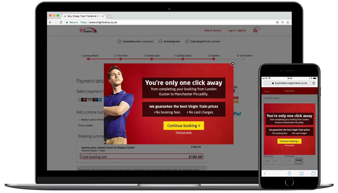
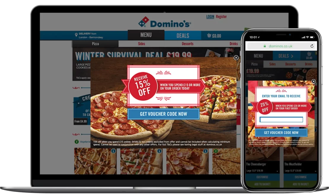
In many cases, that can be true – we’ve seen it ourselves with brands as diverse as Domino’s Pizza, HMV and Virgin Trains:
But with onsite remarketing (as with most things), you get what you pay for.
The problem is that there are plenty of cheap-and-cheerful solutions – also known as ‘overlay shops’ – entering the market promising shortcuts and silver bullets when the reality can be a very different picture.
Why? It’s because this is your website – the importance of the quality of the experience here can never be overstated. Do a good job on your site and you have the opportunity to see your acquisition investments pay off – but attempt to cut corners and your acquisition efforts can go down the drain faster than you can say “leaving so soon?”
At Yieldify, we believe that the customer journey you deliver on your website demands rigorous strategy, attention to detail, and optimization pathways. Without this, you could end up doing more harm than good to your CRO.
The cheap-and-cheerful website overlay software on the market might let you launch overlay campaigns easily, but won’t necessarily help you launch effective overlays that convert visitors.
Types Of Website Overlays
There are many different types of website overlays that you can use to encourage visitors to take action. Below are some of the most common website overlays used.
Behavioural Website Overlays
These types of overlays use behavioural segmentation and on site behaviour to trigger specific overlays. These aim to encourage visitors to move forward in their journey with attention grabbing offers tailored to their browsing behaviour.
A good example of this website overlay would be monitoring time on site, basket value and products viewed. If the visitors looks like a high value customer you could set up an overlay to entice them to checkout. Either with an offer or limited time time based on the products in their basket.
Sales Website Overlays
eCommerce websites can use sale overlays to promote current offers and deals to website visitors. These types of website overlays can help push broad messages and or can ve very targeting depending on what the offer is.
Exit Overlay
An Exit overlay can be used as a last attempt to convince visitors to purchase. These can be used on product pages, basket pages and more. If a user is showing signs of making a purchase but then goes to leave the website you can show an exit overlay, potentially with an offer or social proof to try and convince them to purchase.
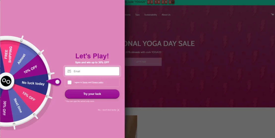
Gamified Website Overlays
Gamified website overlays provide an opportunity to get visitors engaged easily. The example below from yoga brand Loony Legs offers new visitors the chance to get specific offers in exchange for their email. This is a great way to build your mailing lists and a more “fun” option for visitors.
Social Proof Website Overlays
If you don’t like to offer discounts on products social proof overlays could be a nice alternative. You can use this type of website overlay to remind potential customers about your company and display reviews or endorsements to boost sales.
5 Effective Website Overlay Examples
1. Pipeline
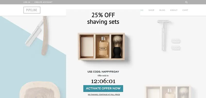
The above website overlay example from Pipeline works well as it targets a specific product category and provides a discount with a limited time duration to give a sense of urgency. A clear call to action directly below the timer also works well.
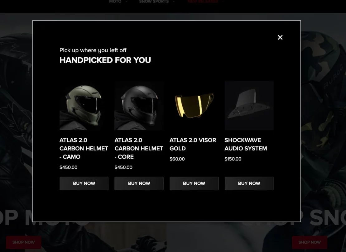
2. Ruroc
Ruroc uses website overlays to quickly engage with returning visitors who previously added items to their shopping baskets. This gives visitors the opportunity to quickly pick up where they left off without having to go through finding the products they were interested in again.
3. Tommy Hilfiger
The below example from Tommy Hilfiger is one of the most common you will see across eCommerce websites. Offering a discount for first time visitors to make their first purchase in exchange for signing up to their email lists.
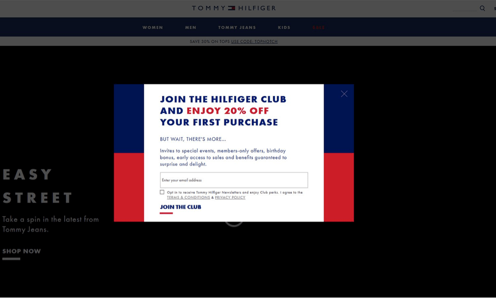
The above overlay sticks to brand colours, blocks out background content and clearly displays the benefits of joining other email subscribers. Whilst this type of website overlay can work just be careful with the timing, having this pop up straight away can be annoying.
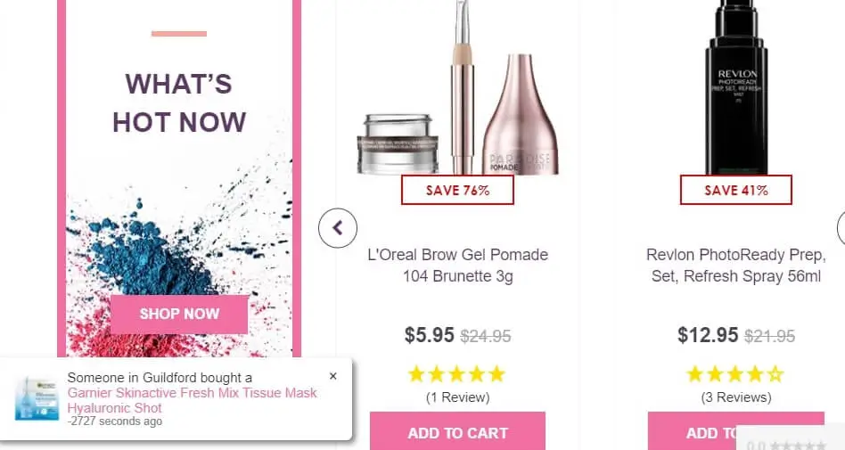
4. Cosmetics Capital
Cosmetics Captial uses a social proof overlay to help encourage visitors to purchase. As we mentioned earlier if you don’t like discounting products this is a great way to entice some FOMO and urgency.
5. SwissWatchExpo
For high value products you can expect basket abandonment to be slightly higher, and time to purchase slightly longer as consumers research and decide if they really want to purchase.
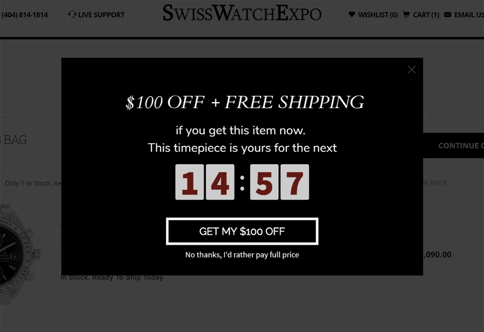
SwissWatchExpo sells high value watches and utilises basket abandonment or exit overlay to try and convince visitors to purchase. The offer of $100 off plus free shipping is sure to tempt most potential customers. Combined with a countdown timer you have the urgency to hopefully spur the user into action.
7 Website Overlay Best Practices
1: Don’t compromise your brand
Consider how much time, effort, and resource you put into the design of your website. Everything from the color and shape of the CTAs, responsiveness and imagery – you’re probably even running plenty of tests to keep iterating on what’s working well.
Why should your website overlays and notifications be any different? They should deliver an experience that’s completely aligned with your brand guidelines, upholding the quality of imagery that you have elsewhere on your site.
The problem is that many overlay shops will restrict you to some pretty rigid templates, where you can change some colors and text, but not much more. For small businesses who want to launch overlays themselves but without design resources in-house, this is great – for a more mature e-commerce business, this can be a jarring experience for the user.
2: Don’t annoy your customers
Campaigns can trigger based on website visitor behavior – but what that behavior is is up to you. The problem here is that if you choose the wrong trigger setting, you can disrupt the customer journey of visitors and potentially annoy them, doing more harm than good.
The usual suspect here is ‘trigger on entry’, which is often used on a first time visitor with lead generation overlays to ask the user to sign-up to a newsletter.
While this might seem a great idea for your brand, it’s the website equivalent of asking for someone’s number before you’ve even said ‘hi’, which never seems to work out well.
You may wish to A/B test this website overlay to see what type of result you get. Most users may simply close the popup and carry on with their journey.
First time visitors are very important to websites so you want to make sure they have a good and smooth experience and hopefully become new customers.
3: Too Broad Targeting
In deciding who’s going to see your campaign, you need to make sure your targeting is on point, or you risk sending irrelevant messages. While you may be tempted to just get something with the basics covered, some of the most effective forms of targeting are based on your shopper’s in-session behavior – such as the value of their basket.
This is hugely valuable because it means that you can safeguard offers such as free delivery only for those shoppers for whom their purchase value will ensure you protect your margins. Domino’s Pizza used it to huge success in engaging the right type of visitor with the right discount incentive:
The problem with basket-value targeting is that this requires an extra level of site mapping – something that not all website overlay solutions will rely on you to do (if they offer the functionality at all).
With this in mind, it’s really worthwhile digging deep into what targeting is actually available to you, as you’ll often find that the valuable stuff relies on a more technical set-up from your side.
4: Respecting the user journey
There’s huge value in having different campaigns set up for different customer journeys – but what if a single customer ends up in several different target segments across the course of their journey?
With some simple onsite remarketing vendors you run the risk of having a visitor trigger multiple campaigns in the course of their session, which is a sure-fire way to get them to abandon your site.
The solution to this is smart frequency capping, which takes into account the fact that some interventions (little notifications in the corner of the screen) are fine to be seen multiple times on the user journey but more disruptive messages (like overlays) are a one-time thing.
It’s not as simple as ‘one message per session’ just as your visitor’s journey isn’t as simple as ‘click-click-buy’, so you need a solution and targeting that reflects that subtlety. You want to make their decision making process easier, not interrupt it.
5: Continuous Testing
There’s a reason that Yieldify has a Consultant team who spend their days poring over pivot tables: if you want good performance, you need to run smart tests and learn from them.
A big part of this is the ability to A/B test your messaging and creatives – this isn’t something that all website overlay technology will provide you with. Without this ability, you’ll never know if you’re getting the best possible performance from your campaigns.
If the end game is to get more email subscribers and build up your email list you want to find the smoothest and most effective way of doing this. You’ll only get here with testing.
Should your target new visitors? Should you put a website overlay on your blog post? Do pop-ups that match a product category perform better? What call to action is best?
6: Focus on driving value
Having great-looking overlay and notification campaigns is important (as we’ve said earlier) but beware of being distracted by cosmetic features that may not necessarily drive value.
The most important elements of your campaign are: a compelling message and careful targeting and triggering – all of which should be refined and optimized through testing.
Funky animations are all well and good, but they’re usually ‘nice to have’s’ – make sure that the core functionality and capabilities we’ve listed elsewhere in this article are there first.
7: Tracking the impact
Everyone knows what they’re here for: making more sales. The problem is that the ability to track the impact that your campaigns are making depends on two things: being able to track sales and run incrementality tests. The bad news is that very few overlay shops provide such functionality.
The reason for this is that tracking sales involves more website mapping – every e-commerce site’s set-up is a little different, so the ability to track sales requires a slightly different approach every time.
If you’ve got a provider who can track sales for you, then the other thing you’ll need is the ability to run an incrementality test (essentially a split-test where half your target group sees no campaign).
Through running these tests to statistical significance for a limited period of time, you’ll be able to see definitively whether or not your campaign is making an impact on your sales.
All of this is essential if you want to ensure that your investment and work is paying off – without it, you’ll never know if it’s worth it.
In conclusion
Onsite remarketing is great because of course it’s an easier way to increase your conversion rate (check out how banners can help increase conversions, too) than starting from scratch or running a labour-intensive programme of A/B/n testing. But don’t let that fool you into thinking that this means that all solutions are the same. As with all things in life, you get what you pay for.
If you’re looking for a smart solution that comes with an even smarter team to ensure your campaigns are on-point and fully-optimized, check out Yieldify’s free Customer Journey Optimisation consultations.